Line, Scatter & Bubble Chart
This component provide the functionality to generate line, scatter or bubble chart.
Data
Data Source
SDD with a list of values for the point chart. The SDD requires the data keys to be defined (see below).
Example of custom user input:
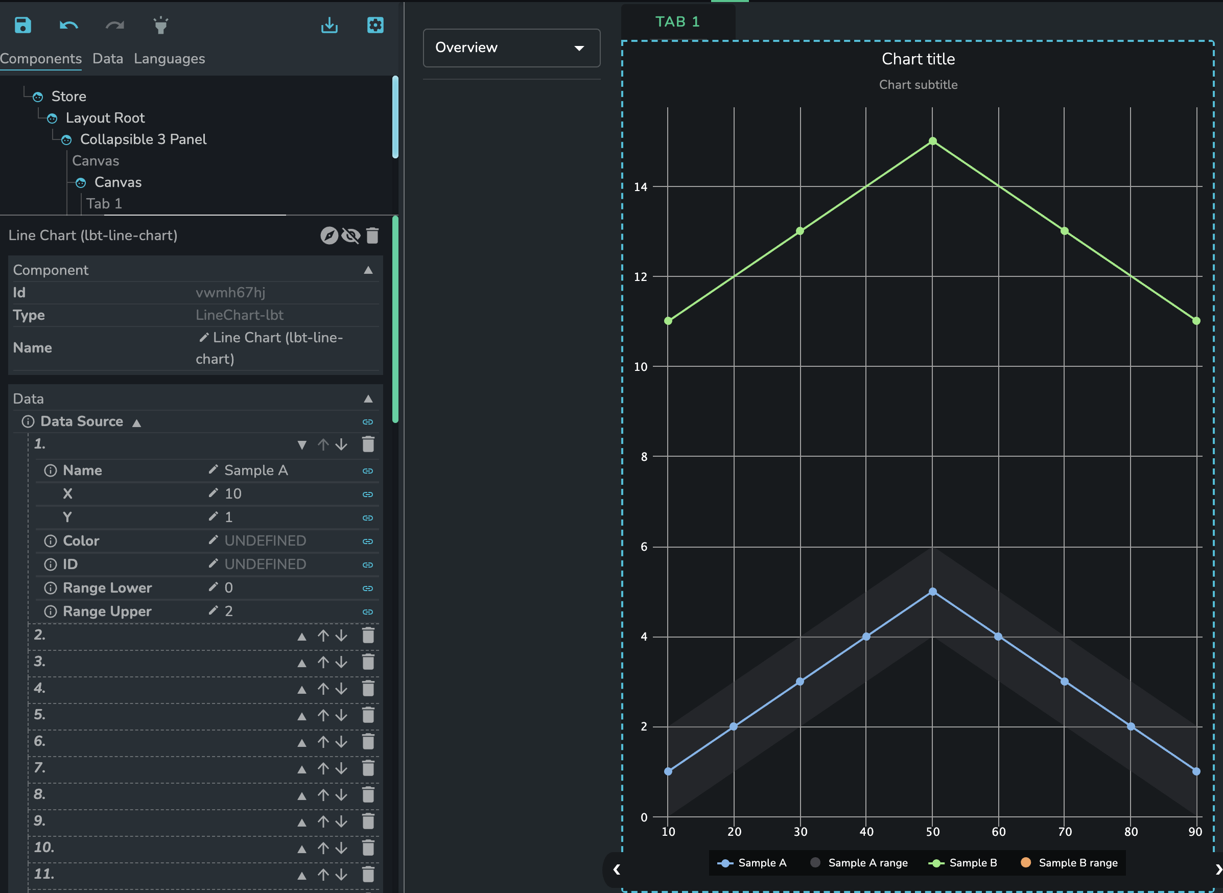
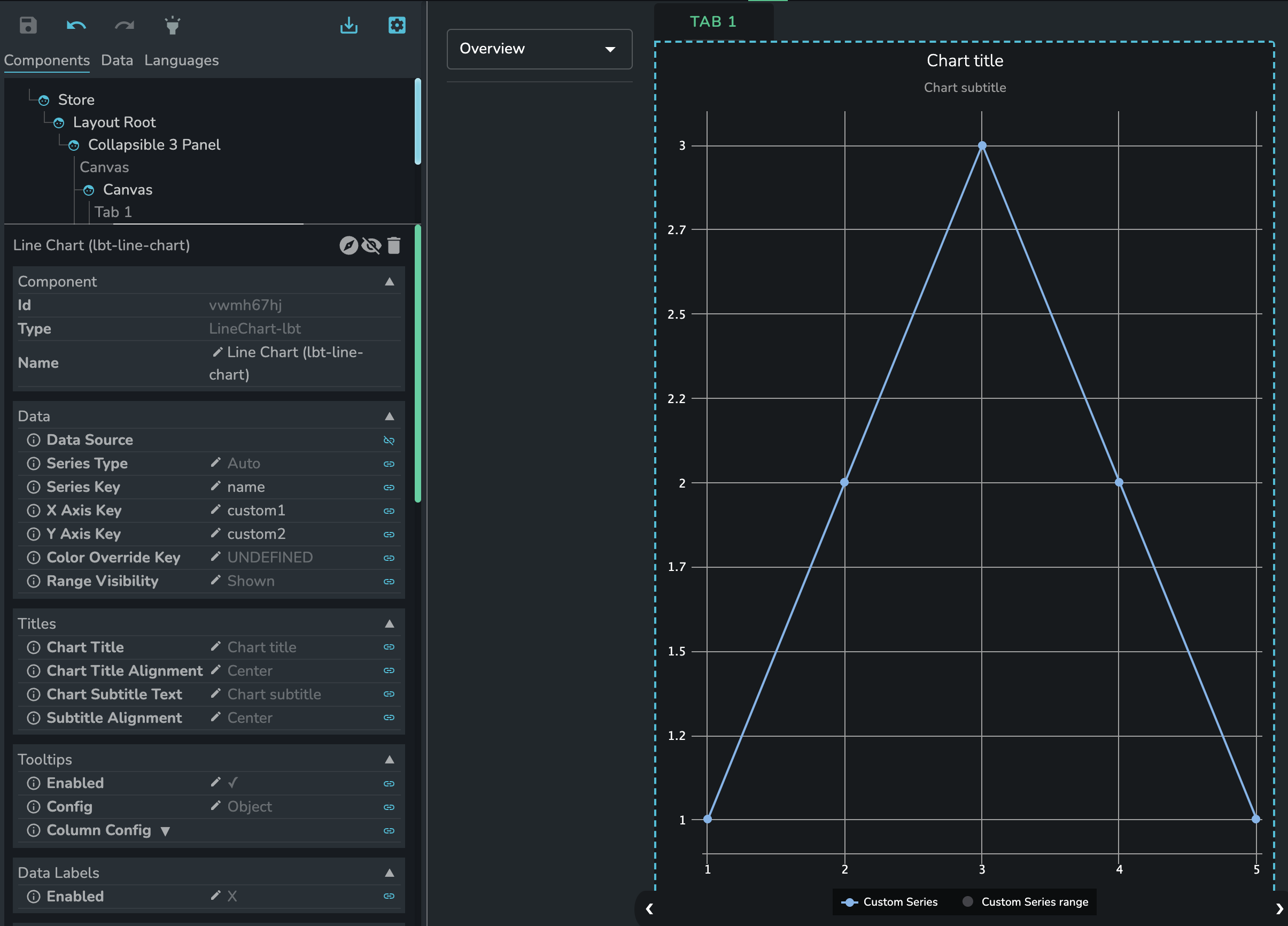
Alternatively the data source can be linked to an SDD as in the example below.
{
  "sddFormat": "sdd/table/array-of-objects",
  "version": "1.0.0",
  "definitions": {
    "name": {
      "kind": "string",
      "optional": true
    },
    "custom1": {
      "kind": "number",
      "optional": true
    },
    "custom2": {
      "kind": "number",
      "optional": true
    }
  },
  "data": [
    {
      "name": "Custom Series",
      "custom1": 1,
      "custom2": 1
    },
    {
      "name": "Custom Series",
      "custom1": 2,
      "custom2": 2
    },
    {
      "name": "Custom Series",
      "custom1": 3,
      "custom2": 3
    },
    {
      "name": "Custom Series",
      "custom1": 4,
      "custom2": 2
    },
    {
      "name": "Custom Series",
      "custom1": 5,
      "custom2": 1
    }
  ]
}
Aggregation Method
Component level data aggregation method that determines how should the data be aggregated in case there are more than one values with the same X and Y axis values.
The available options are:
NoneSumAverageMedian
Series Type
Type of available series config:
Auto(automatically generates series based on the provided series key)Manual(manually select which data to extract)
Series Config
A list of custom series. Only shown if the series type is manual. Has the following properties:
Name
(optional)
Name of the selected data
Sub-filter data
Standard sub-filter data that determines which data to show which the following methods:
"equal""contains""between""lt""gt""lte""gte"
{
  "column": {
    "key": "column",
    "value": "",
    "method": "equal"
  }
}
X Axis Key
The name of the property to use for determining the x-axis value.
Y Axis Key
The name of the property to use for determining the y-axis value.
Upper Range Key
The name of the property to use for determining the bar's upper range.
Lower Range Key
The name of the property to use for determining the bar's lower range.
Color
(optional)
fixed color override of the points of the manual series.
Show In Legend
Should the series be shown in the legend.
Range Visibility
Determines if and how the series range is shown.
Shown(default) always show the rangeHiddencomplete hide the rangeShown On Togglethe range will be listed in the legend but only shown in the chart if clicked in the legend
Visible
Should the manual series be visible.
Line Width
Custom line width for the series (2 units by default).
Dash Style
The style of the line for the manual series.
Marker Enabled
The name of the property to use for determining the category of the point. Only shown if the data is linked to custom
SDD.
Marker Symbol
The name of the property to use for changing marker symbol for the series.
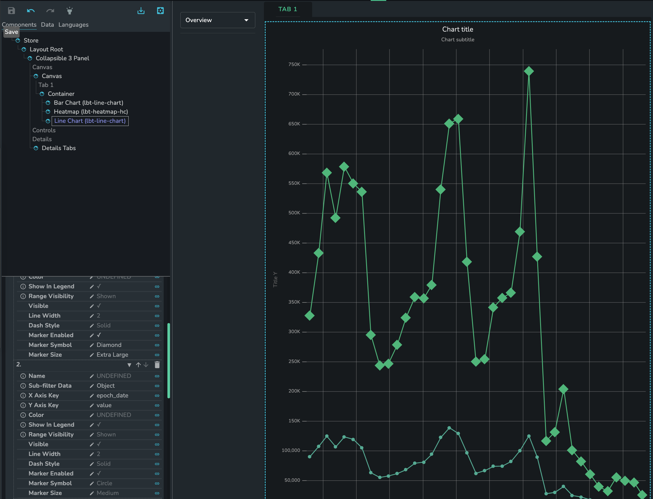
Manual Series Example
Marker Size
The name of the property to set proper marker size for the series.
Bubble Min Size
(only applies to the Bubble chart)
Bubbles will automatically size between the min size and max size to reflect the z value of each bubble. Can be either pixels (when no unit is given), or a percentage of the smallest one of the plot width and height. Defaults to 8.
Bubble Max Size
(only applies to the Bubble chart)
Bubbles will automatically size between the min size and max size to reflect the z value of each bubble. Can be either pixels (when no unit is given), or a percentage of the smallest one of the plot width and height. Defaults to 20%.
Manual Series Example
Series Key
The name of the property to use for determining the line's series. Only shown if the data is linked to custom
SDD, and the series type is set to Auto.
X Axis Key
The name of the property to use for determining the line's X axis value. Only shown if the data is linked to custom
SDD, and the series type is set to Auto.
Y Axis Key
The name of the property to use for determining the line's Y axis value. Only shown if the data is linked to custom
SDD, and the series type is set to Auto.
Upper Range Key
The name of the property to use for determining the line's upper range. Only shown if the data is linked to custom
SDD, and the series type is set to Auto.
Lower Range Key
The name of the property to use for determining the line's lower range. Only shown if the data is linked to custom
SDD, and the series type is set to Auto.
Color Override Key
(optional)
The key to use to extract custom colors from data. If the specified key or the value defined by the key is undefined then the color is generated automatically.
Range Visibility
Determines if and how the series range is shown.
Shown(default) always show the rangeHiddencomplete hide the rangeShown On Togglethe range will be listed in the legend but only shown in the chart if clicked in the legend
Display Options
Pan And Zoom
Enable pan and zoom for numeric axis. To zoom, click and hold the left mouse button. To pan, press the "shift" key and drag on the chart.
Chart Type
The type of the chart. The supported type are: Line Chart, Scatterplot, Bubble Chart.
Each type has some type-specific differences. For example, only the Bubble Chart has a Z axis but doesn't support ranges.
LineScatterBubble
Bubble Min Size
(only applies to the Bubble chart)
Bubbles will automatically size between the min size and max size to reflect the z value of each bubble. Can be either pixels (when no unit is given), or a percentage of the smallest one of the plot width and height. Defaults to 8.
Bubble Max Size
(only applies to the Bubble chart)
Bubbles will automatically size between the min size and max size to reflect the z value of each bubble. Can be either pixels (when no unit is given), or a percentage of the smallest one of the plot width and height. Defaults to 20%.
Marker Enabled
The name of the property to use for determining the category of the point. Only shown if the data is linked to custom
SDD.
Marker Symbol
The name of the property to use for changing marker symbol for the series.
Marker Size
The name of the property to set proper marker size for the series.
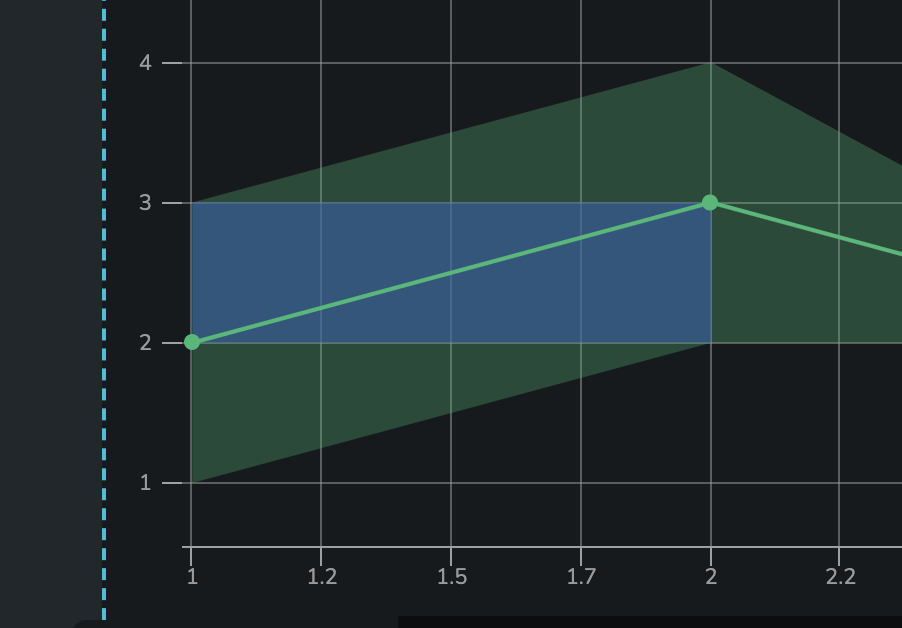
Colored Areas
Custom colored areas on the chart.
Color
Color of the area.
Opacity
How transparent should the area be (0 - 1).
Top
Upper Y axis coordinates.
Bottom
Lower Y axis coordinates.
Right
Right-hand side coordinates of the X axis.
Left
Left-hand side coordinates of the X axis.
ID Key
The name of the property to use for determining the ID for each data point. IDs are necessary for point selection.
Range Visibility
Determines if and how the series range is shown. Only shown when the data is linked to a custom SDD,
Shown(default) always show the rangeHiddencomplete hide the rangeShown On Togglethe range will be listed in the legend but only shown in the chart if clicked in the legend
Minimum Height
The minimum height of the chart in rem units. 2rem by default.
Titles
Chart Title
(optional)
The title text to be displayed above the chart.
Chart Title Alignment
(Optional)
How the title should be aligned. Supported values:
LeftCenterRight
Chart Subtitle Text
(optional)
The subtitle text to be displayed above the chart.
Chart Subtitle Alignment
(Optional)
How the title should be aligned. Supported values:
LeftCenterRight
Tooltips
Enabled
Enable or disable tooltips for all data points
Config
Format for a simple tooltip. Specify a suffix or prefix and set the decimal places.
{
  "prefix": "",
  "suffix": "",
  "multiplier": "auto",
  "decimalPlaces": 1,
  "capitalize": true,
  "useLocale": true
}
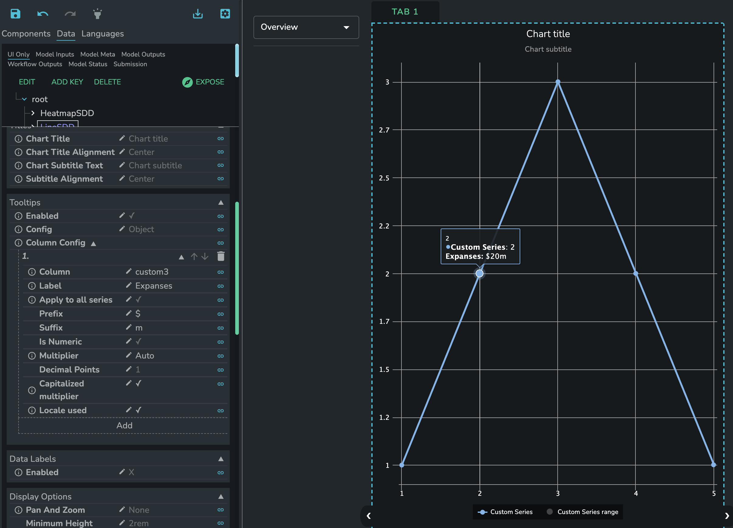
Column Config
Construct a custom tooltip by combining data from columns in the source data.
Column
Column from the data source to display in the tooltip.
Label
Alias to display instead of the column name.
Apply to all series
Should this column tooltip be displayed for all series?
Applies To Series
Which series should this tooltip schema apply to.
Prefix
Tooltip prefix.
Suffix
Tooltip suffix.
Is Numeric
Is the tooltip numeric? If yes, hide the properties related to numeric tooltips.
Multiplier
Converts the value to the chosen multiplier. For example, the option "Thousands" would convert the value "1000" to "1k".
Decimal Points
Decimal points to add to the number.
Capitalized multiplier
Capitalizes the multiplier value.
Locale used
Should the tooltip be formatted based on user locale?
Custom tooltip example:
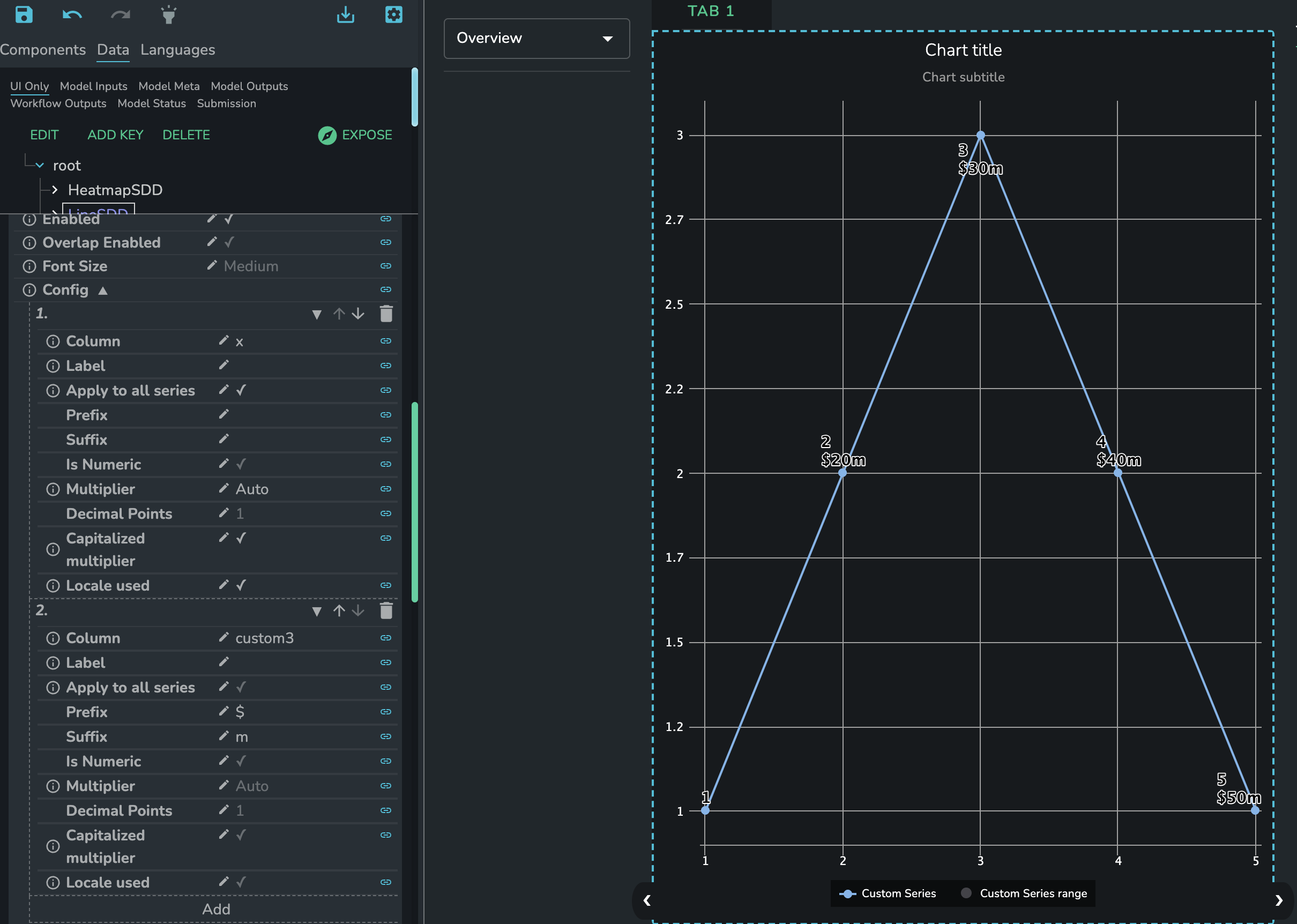
Data Labels
Enabled
Should data labels for the chart series be shown.
Overlap Enabled
Allow data labels to overlap if the is insufficient space.
Font Size
Data label font size.
SmallMediumLarge
Config
Data label configuration.
Column
Column from the data source to display in the data labels.
Label
Alias to display instead of the column name.
Apply to all series
Should this column data label be displayed for all series?
Applies To Series
Which series should this data label schema apply to.
Prefix
Data label prefix.
Suffix
Data label suffix.
Is Numeric
Is the data label numeric? If yes, hide the properties related to numeric data labels.
Multiplier
Converts the value to the chosen multiplier. For example, the option "Thousands" would convert the value "1000" to "1k".
Decimal Points
Decimal points to add to the number.
Capitalized multiplier
Capitalizes the multiplier value.
Locale used
Should the data label be formatted based on user locale?
Legend
Enabled
A flag specifying whether the legend should be displayed in the chart.
Orientation
(optional)
Defines the way in which legend items are laid out within the available space. Available options:
horizontalvertical
Defaults to horizontal
Horizontal legend position
(optional)
Defines where the legend sits along the horizontal plane. Available options:
LeftCenterRight
Defaults to center
Vertical legend position
(optional)
Defines where the legend sits along the vertical plane. Available options:
topmiddlebottom
Defaults to bottom
Categorical / Value Axis
Enabled
Should the axis values be shown or not.
Title
(optional)
Title to display on the axis.
Type
The type of the axis values. The available options are:
Linearnumeric values that support numeric formattingLogarithmiclogarithmic axis values that support numeric formattingDatetimedate values that support date-time formatting based on date-fns library formattingCategorytext values
For date-time type standard conventions can be used. For example the 2021-05-19 can be formatted with the
pattern dd/MM/yyyy to show up as 19/05/2021.
For more date-time formats please refer to https://date-fns.org/v2.21.1/docs/format.
Tick Format
Axis value (tick) formatting available if the axis type is numeric.
{
  "prefix": "",
  "suffix": "",
  "multiplier": "auto",
  "decimalPlaces": 1,
  "capitalize": true,
  "useLocale": true
}
Range
Manually filter Value Axis values to be displayed. Value Axis values are mapped to integers. As an example, use [0,3] to display the first four Value Axis values.
In the case where the creator wishes to specify only an upper or lower range on an axis, the string auto may be
supplied for the bound whose value is inconsequential. For instance, an upper bound of 100 on an axis may be specified
like so:
[
  "auto",
  100
]
Grid Lines Enabled
Toggle gridlines for the axis on or off`
Plot Lines
Display a line perpendicular to the axis. Multiple lines can be displayed. As an example:
[
  {
    "value": 1,
    "width": 3,
    "color": "green",
    "dashStyle": "solid",
    "label": "Limit"
  }
]
Axis On Opposite Side
Display the axis on the opposite side of the chart.
Reverse
Reverse axis values.
Tick Rotation Limit
Limit the rotation of axis ticks (in degrees).
Show first/last label
Should the first label on the axis be shown. Sometime, when the categorical axis ticks are labeled, extra axis items are shown. And if they don't have a label the index will be shown instead. This property allows the user to hide this label.
Selection
Type
Options for point selection.
None(point selection is disabled)Single(one point can be selected at a time)Multi(multiple points can be selected at a time when holding down theshiftkey)
Selected Points
Property that the user must like to in order to enabled point selection.
Colored
Boolean value determining if the selected points should be colored or not.
Selected Point Color
The color of the selected points.
Animation
Enabled
Should animation be enabled or not.
Duration
Duration of chart animations (400 milliseconds by default).
Caption
Text
Specify text to display as a caption below the chart.
Alignment
Caption alignment
leftcenterright
Watermark
Enabled
Toggle the watermark on or off. The watermark shows the date and name of a logged-in user.
Text
Extra text to display in the watermark,